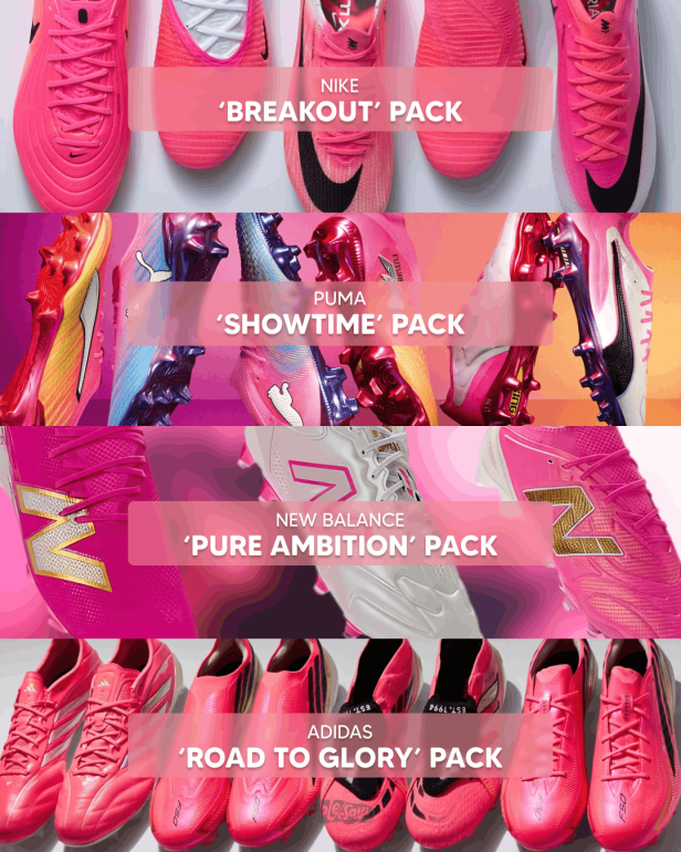
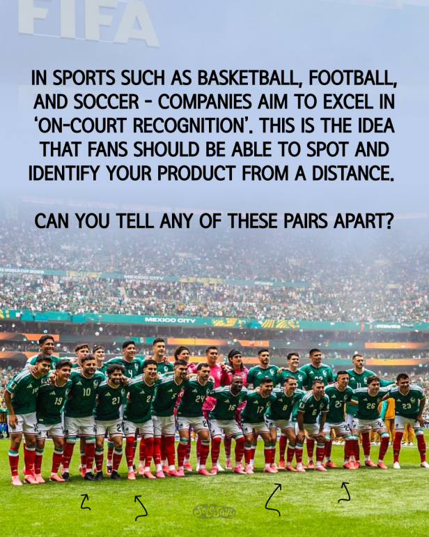
Why is everyone wearing pink boots in the 2026 FIFA World Cup?
This isn’t a matter of a single brand following a similar color theme, no. Pretty much every major brand has their signature athletes sporting pink cleats in the 2026 FIFA World Cup.
Ahead of this tournament, Nike launched the ‘Break Out’ collection. adidas named their World Cup collection ‘Road to Glory’. Meanwhile, Puma went with the “Showtime” pack for their star athletes. New Balance, which has spent the last five years buying up space in the footwear world thanks to their innovations, even dropped a pink boot collection.
In past renditions of the biggest tournament in sports, each brand would create a pack for their products that fit a central theme. For example, in 2014 adidas launched the ‘Battle Pack’– a boot collection themed around old war paint used by Brazilian warriors. This, of course, fit the theme for the host nation of Brazil. Lionel Messi even got a special boot that fit the same Battle theme, albeit it changed the colors to match the Argentine kits.
That same tournament, Nike’s Elite pack positioned now iconic football boots with bright colors and even introduced Flyknit into the sport of football. The boots were bright. They were breathable, and they were iconic. The same boot collection that defined a new era of Nike Football was the same boot that Mario Gotze wore when he scored the decisive goal in the 2014 World Cup Final, breaking millions of Argentine hearts in the process.
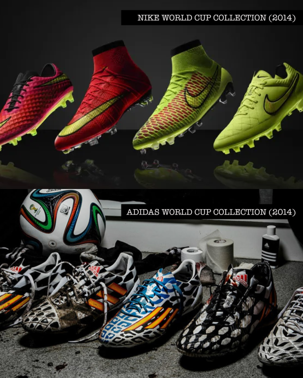
This is not a case of rose-tinted glasses either. Both collections truly stood on their own. The marketing that followed them was identifiable and exciting. The same thing that can be said about this year’s X2 collection from Nike. That said, the boots made for the pitch have somehow been lost in translation.
But how did we get here? Where the biggest brands in the sport of football historically- whether it is Nike, adidas, Puma- are all sending their star athletes out to the pitch in boots of the same color?
The Athletic pointed out that the shoe companies discovered that players associated bright colors with confidence. The bright pink also does not clash with any uniforms and easily sticks out. In their coverage, the outlet found that all brands found some justification to explain the use of pink that essentially boils down to how identifiable their boots are. But by all of the boots being pink, no one wearing them is standing out.
It also appears that the design choice is an unfortunate coincidence of the brands all deciding to follow trend forecasts at the same time. WGSN has already taken credit for it- as the world’s leading consumer and design trend forecasting company, they predicted ‘Electric Fuchsia’ as the color of SS2026. If that is truly the case, then it is a little disappointing for football fans that have fallen in love with all of the pop and circumstance that surrounds the World Cup.
These boot collections used to inspire a generation of fans to replicate their favorite players through their strong campaigns and creative design. The on-the-field performance helped, of course. Now, it seems all of the brands are more interested in not missing the mark. They are more interested in being trendy, rather than creating the trends themselves.
Will this summer’s array of boot collections be looked at fondly in the future by fans? Maybe.
But at a time when real estate on physical and virtual shelves is the most competitive it’s ever been- it is so bizarre to see major brands launch boots that look like they were separated at birth.